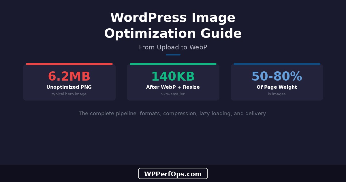
Images account for 50-80% of a typical WordPress page’s total weight. That single stat explains why image optimization is consistently the highest-ROI speed improvement for most sites. You can upgrade your hosting, fine-tune your caching, and minify every CSS file — but if your hero image is a 4MB PNG, none of that matters. Your Largest Contentful Paint will still be measured in seconds, not milliseconds.
The good news: image optimization has a clear, repeatable pipeline. Choose the right format, size images to their actual display dimensions, compress them intelligently, deliver them efficiently, and handle lazy loading correctly. This guide walks through each step — with specific tools, settings, and WordPress-specific techniques that work in 2026.
Why Images Matter for Core Web Vitals
Your hero image is almost always the Largest Contentful Paint (LCP) element — the metric Google weighs most heavily for page experience. Unoptimized images also cause Cumulative Layout Shift (CLS) when they lack dimensions. If you’re not familiar with these metrics, read our Core Web Vitals guide first. For a list of common image-related mistakes, see our 15 WordPress speed mistakes guide (mistakes 6, 8, and 11).
Understanding Image Formats
Not all image formats are created equal. The format you choose determines both the file size and quality ceiling for every image on your site. Here’s what you need to know about each option in 2026.
JPEG: The Reliable Workhorse
JPEG has been the web standard for photographs since the 1990s, and it’s still a solid choice. It handles photographic content well with lossy compression, but it doesn’t support transparency and its compression algorithm is showing its age. JPEG is your fallback format — the one that works everywhere, including very old browsers.
PNG: When You Need Transparency
PNG uses lossless compression, which means pixel-perfect quality but significantly larger file sizes. Use PNG only when you genuinely need transparency (logos, icons, overlays). For photographs, PNG files are typically 5-10x larger than JPEG at comparable visual quality. We still see sites serving full-page hero images as PNGs — that’s almost always a mistake.
WebP: The Modern Standard
WebP is where you should be in 2026. Developed by Google, it delivers 25-34% smaller files than JPEG at equivalent visual quality, supports both lossy and lossless compression, and handles transparency. Browser support is now universal — every modern browser including Safari (since version 14) supports WebP. There’s no reason not to use it as your primary format.
AVIF: The Future (Almost Here)
AVIF pushes compression even further — typically 30-50% smaller than WebP. It’s based on the AV1 video codec and produces impressive results, especially at low file sizes where JPEG shows visible artifacts. The catch: browser support is still growing (Chrome, Firefox, and Safari 16.4+ support it, but encoding is slow and some older mobile browsers don’t). Use AVIF as a progressive enhancement with WebP or JPEG fallback, not as your only format.
Same Photo as JPEG
180KB
Same Photo as WebP
120KB
Same Photo as AVIF
85KB
Responsive Images and srcset
One of the most common image mistakes is serving a single large image to every device. A 2048px-wide hero image makes sense on a desktop monitor, but a phone with a 390px-wide screen doesn’t need — and shouldn’t download — all those extra pixels. That’s where responsive images come in.
WordPress has built-in responsive image support since version 4.4. When you upload an image, WordPress automatically generates multiple sizes: 150px (thumbnail), 300px (medium), 768px (medium-large), 1024px (large), 1536px, and 2048px (full). It then adds srcset and sizes attributes to <img> tags, telling the browser which version to download based on the viewport width. The browser picks the smallest image that still looks sharp for the user’s screen.
!
Uploading Oversized Source Images Defeats the Purpose
If your site’s content area is 1200px wide, there’s no reason to upload a 5000px image from your camera. WordPress will generate the intermediate sizes, but the original 5000px version still lives in your media library, wasting storage and sometimes getting served to high-DPI screens. Before uploading, resize your source images to a maximum of 2x your largest display size — so 2400px for a 1200px content area. This keeps srcset efficient and prevents unnecessarily large downloads.
How to Audit Your Actual Display Sizes
Open Chrome DevTools (F12), hover over an image, and look at the tooltip. It shows both the intrinsic size (the actual file dimensions) and the rendered size (how large it appears on screen). If you see “Intrinsic: 3000×2000” and “Rendered: 800×533,” that image is downloading 14x more pixels than needed. Your image optimization plugin should be generating a size close to the rendered dimensions for each breakpoint.
If your theme uses custom layout widths, you may want to register custom image sizes in your theme’s functions.php using add_image_size(). This ensures WordPress generates versions that match your actual display contexts — for example, a 780px hero width or a 400px card thumbnail — rather than relying solely on the default sizes.
Compression: Lossy vs Lossless
Compression is where the real savings happen. Even after choosing the right format and dimensions, intelligent compression can cut file sizes by another 50-80% with virtually no visible quality loss.
Lossy Compression: The Smart Default
Lossy compression discards image data that the human eye can’t easily perceive. At quality levels of 60-80% (depending on the tool), the visual difference between the original and compressed version is imperceptible to most people, but the file size drops dramatically. A 500KB JPEG at quality 80 looks identical to the full-quality version on screen but saves 60% of the bandwidth.
For web images, lossy compression at 75-82% quality is the sweet spot. Below 60%, you’ll start seeing visible artifacts — banding in gradients, halos around text, and mushy details. Above 85%, you’re paying a significant file size premium for quality improvements that nobody can see on a screen.
Lossless Compression: For Specific Use Cases
Lossless compression reduces file size without discarding any data. The quality is identical to the original, but the savings are much smaller — typically 10-30% instead of 60-80%. Use lossless for screenshots, diagrams, and technical illustrations where every pixel matters. For photographs, it’s rarely worth the tradeoff.
WordPress Image Optimization Plugins
You don’t need to manually compress every image. These plugins handle it automatically on upload and can bulk-optimize your existing media library:
ShortPixel — Our top recommendation. Excellent compression quality, WebP/AVIF conversion, and a generous free tier (100 images/month). The “Glossy” preset is ideal for web use — lossy compression that’s visually indistinguishable from the original.
Imagify — Made by the WP Rocket team. Strong compression with an intuitive interface. The “Aggressive” mode delivers great results for most sites. More expensive than ShortPixel at scale.
Smush — Popular free option from WPMU DEV. The free version is limited (lossless only, 5MB max per image, no WebP without Pro). Fine for small sites, but you’ll quickly hit the limits on anything larger.
EWWW Image Optimizer — Does compression locally on your server instead of sending images to a cloud API. Good for privacy-sensitive sites, but requires more server resources and the compression isn’t quite as aggressive as cloud-based tools.
Before Optimization
2.4MB
total page image weight
After Optimization
380KB
84% reduction, same visual quality
Don’t forget your existing media library. Most optimization plugins offer a bulk optimization feature that processes all previously uploaded images. If you have thousands of images, run this during low-traffic hours — it’s CPU-intensive but worth the one-time effort.
Lazy Loading Done Right
Lazy loading defers the download of off-screen images until the user scrolls near them. Instead of loading all 25 images on a page at once, the browser loads only the 2-3 that are visible and fetches the rest on demand. This dramatically reduces initial page weight and speeds up the first meaningful paint.
WordPress has included native lazy loading since version 5.5, automatically adding loading="lazy" to images and iframes. In most cases, this works well out of the box. But there’s one critical mistake that we see on nearly every site we audit.
!
Never Lazy Load Your Hero Image
Your above-the-fold hero image is almost always your Largest Contentful Paint (LCP) element. Lazy loading it tells the browser to deprioritize the single most important visual element on your page. The result: your LCP score tanks. WordPress 6.3+ automatically skips lazy loading on the first image in post content, but custom themes and page builders often override this. Check your hero image’s HTML — if you see loading="lazy" on it, remove it and add fetchpriority="high" instead.
- Lazy loading the hero/LCP image (delays the most important visual element)
- Lazy loading images that are above the fold on mobile (smaller viewport shows fewer images)
- Using a JavaScript-based lazy loader when native
loading="lazy"works fine
- Let WordPress handle lazy loading natively for below-the-fold images
- Add
fetchpriority="high"to your hero image for faster LCP - Lazy load iframes (YouTube, Google Maps) — they’re often the heaviest embeds on a page
- Use video facades (static preview images) for embedded video players
Preloading Critical Images
While lazy loading delays non-critical images, preloading does the opposite — it tells the browser to start downloading your most important image immediately, before it even parses the HTML that references it. For your LCP image, this can shave hundreds of milliseconds off your load time.
The technique uses a <link rel="preload"> tag in your page’s <head>:
<link rel="preload" as="image" href="/wp-content/uploads/hero.webp" type="image/webp">WordPress 6.3 introduced automatic LCP image preloading using the fetchpriority="high" attribute. In WordPress 6.5+, the system goes further by adding a <link rel="preload"> for the featured image when it’s likely the LCP element. If your theme properly uses the_post_thumbnail() or the block editor’s image block, this works automatically.
Test With Lighthouse
Run a Lighthouse audit in Chrome DevTools and look for the “Preload Largest Contentful Paint image” opportunity. If it appears, your LCP image isn’t being preloaded and you’re leaving performance on the table. Lighthouse will even show you the exact URL to preload. Also check that your LCP image has fetchpriority="high" and does NOT have loading="lazy".
A word of caution: only preload 1-2 images maximum. Preloading too many resources defeats the purpose — you’re telling the browser everything is high priority, which means nothing is. Reserve preloading for your actual LCP image, not decorative elements or below-the-fold content.
CDN and Image Delivery
A Content Delivery Network (CDN) serves your images from servers geographically close to your visitors. Instead of every request traveling to your origin server (which might be in Virginia while your visitor is in Tokyo), the CDN serves a cached copy from a nearby edge location. The result: dramatically lower latency for image downloads.
!
Without a CDN, Every Visitor Hits Your Origin Server
If your server is in New York and a visitor in Sydney requests a 200KB hero image, that data travels ~16,000 km. Add in TCP connection overhead, TLS handshake, and the physical speed of light through fiber, and you’re looking at 200-400ms of latency before the first byte even arrives. A CDN with an Australian edge location reduces that to under 30ms. Multiply that by every image on the page, and the savings are substantial.
Traditional CDN vs Image CDN
A traditional CDN (Cloudflare, BunnyCDN, KeyCDN) caches and serves your existing image files as-is. You still handle optimization, resizing, and format conversion yourself — the CDN just delivers them faster.
An image CDN (Cloudflare Polish/Image Resizing, imgix, Cloudinary) goes further: it resizes, compresses, and converts images on-the-fly at the edge. You upload one high-quality source image, and the CDN automatically serves the optimal version for each visitor’s device, browser, and connection speed. This is the most hands-off approach — you upload images and forget about format conversion and responsive sizing.
For most WordPress sites, a traditional CDN combined with a good image optimization plugin (ShortPixel or Imagify) is the most practical setup. Image CDNs add complexity and cost that’s better suited for high-traffic sites with thousands of images.
WordPress-Specific Image Settings
Beyond general image optimization, WordPress has several settings and features that directly affect image performance.
Review Your Media Settings
Under Settings → Media, WordPress defines three default image sizes: Thumbnail (150×150), Medium (300×300), and Large (1024×1024). These are the intermediate sizes generated on upload. If your theme never uses the 150×150 thumbnail, that’s wasted storage and processing time for every image. Conversely, if your theme needs a 600px card image and the closest default is 300px, WordPress will serve the larger 1024px version — wasting bandwidth.
Audit which sizes your theme actually uses and adjust accordingly. You can also disable unused sizes by setting their dimensions to 0 in Media settings, or by hooking into intermediate_image_sizes in your theme.
Featured Image Best Practices
Your featured image appears on archive pages, social media shares, and often as the hero image on the post itself. Optimize it aggressively:
- Use 1200x630px for optimal social media display (matches Open Graph recommendations)
- Compress to WebP at 75-80% quality — aim for under 100KB
- Ensure your theme adds
fetchpriority="high"when displaying the featured image as a hero - Use
wp_get_attachment_image()instead of raw<img>tags to get automatic srcset and lazy loading
WooCommerce Product Images
E-commerce sites face unique image challenges: multiple product photos per item, zoom functionality requiring high-resolution originals, and gallery lightboxes that load several large images at once. WooCommerce product images deserve their own optimization strategy — we cover this in depth in our WooCommerce speed optimization guide. The short version: limit gallery images to 5-6 per product, use WebP, and configure WooCommerce’s built-in image regeneration after changing thumbnail sizes.
Your Image Optimization Checklist
Here’s the complete checklist. Work through it top to bottom — the items are ordered by impact.
- Install an image optimization plugin (ShortPixel or Imagify) with WebP conversion enabled
- Bulk-optimize existing images in your media library — don’t just optimize new uploads
- Resize source images before uploading — maximum 2x your largest display width
- Set compression to lossy at 75-82% quality (ShortPixel “Glossy” or Imagify “Aggressive”)
- Verify lazy loading is working on below-the-fold images (check for
loading="lazy") - Confirm your hero image is NOT lazy loaded — remove
loading="lazy"and addfetchpriority="high" - Add width and height attributes to all images to prevent CLS
- Enable a CDN for faster global image delivery
- Use video facades for YouTube and Vimeo embeds
- Audit unused image sizes in your Media settings and disable them
- Test with Lighthouse — look for “Properly size images” and “Serve images in next-gen formats”
Keep Learning
Image optimization is one of the most impactful pieces of WordPress performance, but it’s not the whole picture. These resources cover the bigger performance landscape.
Understand the Metrics
Core Web Vitals for WordPress
Learn what LCP, INP, and CLS mean, how to measure them, and why Google uses them to rank your site.
Avoid Common Pitfalls
15 WordPress Speed Mistakes
The most common performance mistakes we see on WordPress sites — including three image-specific ones this guide expands on.
Calculate the Cost
How a Slow Site Costs You Money
The business case for speed: conversion rates, bounce rates, and the real revenue impact of every extra second.
Get Your Images — And Your Entire Site — Optimized
Image optimization is just one piece of the performance puzzle. Our free mini audit analyzes your entire WordPress site and identifies every speed bottleneck — so you know exactly what to fix first.